I don't really watch much television, but I feel as if I am using two different TV themes on this blog post.
The first is the sensationalizing done by programs such as The Bachelor; "The most shocking season, ever! The biggest reveal to date!" My family thinks this room has had the most satisfying transformation.
The other one is from my mild addiction to the British television programme (spelled in "truebrit"), Escape to the Country. I find it on Youtube. The premise is much like the American program "House Hunters", where the buyers are shown three properties. Only, these are properties in Britain, and they don't have to choose one, and I get to enjoy all the delicious homes shown for sale. I have long been partial to British design- any visitors will be familiar with my well worn, often thread bare seating choices, plenty of muddy boots, dogs, books and always cold house. Except in summer when I have eschewed air conditioning in favor of open windows and fans- in which case my house is, well, hot. (I have pledged to my family to try air conditioning in our new Virginia farm.)
In any case, in Britain, they have different names for the same rooms we have. We have a "Powder Room", or "Half Bath". They have a "Cloak Room". They have "Bathrooms" and "Shower Rooms". We have "Bathrooms" regardless of whether they have a bathtub, a shower or both. We have "Living Rooms", and they have "Reception Rooms." I gather "reception rooms" are thus named with receiving guests in mind, as are our "living rooms". And what we would call a "Family Room", maybe, is called, in Britain, "a snug." I love the term, as it conjures up images of snuggling down by the fire, with a good book, a cat on your lap and a dog on your feet. The snug is just for the family, has the crossword puzzle half done, chairs you can sink into and soft lighting. All very "Hygge."
When we looked at Foxcroft, it was apparent there are a lot of rooms, and the largest of these are designed around entertaining. So, "Reception Rooms." But, there was one smaller room that felt like a "Snug." It has a fireplace and with the door closed would be warm and cozy. But, it is also at the very front of the house! Adjacent to the front door, which would traditionally make it a reception room, or a parlor. My desire for this house is to give it a deeper sense of history, so when you are here, the exact time of construction is not obvious. So, in this room, I wanted to make it a "snug parlor". That is make it inviting and cozy, but also a little more traditionally formal in its bones.
On top of that, this is the room that Huz has chosen to be his office. Since he works from home now, this is a place where he spends a good bit of time. So, I wanted it to be cheerful, and productive. Which for me means organized and neat.
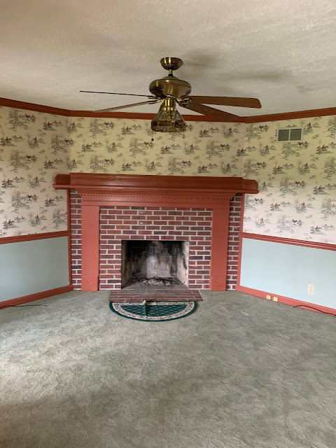
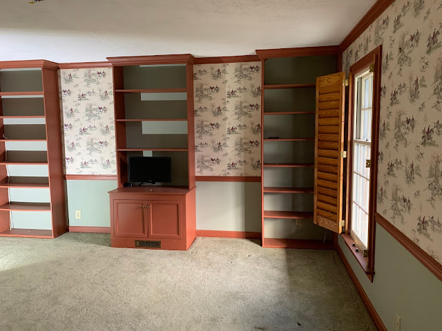
As for the most shocking season ever! This is where we began with the snug/parlor.
The dominant feature of this room is the fireplace. Set on an angle, and nearly 8 feet wide, it has an awkward balance, too much brick around the firebox, making the mantle piece legs look skinny and firebox look small. It appeared to me as a really large forehead of brick. But, I do love a fireplace! So, I wanted to play up the excellence of having one and make it look balanced and pretty.

Just about every wall at Foxcroft was wallpapered. I do love wallpaper, but I tend to take smaller doses, and most wallpaper has an expiration date, after which if feels uncomfortably dated. Exceptions to that are the true classics. William Morris, Colefax and Fowler, Scalamandre; historic wallpapers can be timeless. The wallpaper in this room was excellent. It is a fox hunting print, with scarlet coats, hounds and leaping horses. It is without a doubt the best wallpaper in the house. So, I sat with it for a while. Could I make it work if I got rid of the seafoam green and tomato red of the walls, trim and carpet?
The carpet was pretty new and in good condition. But it was carpet. And, I am not a fan of carpet at all, and not a green shag person. Plus, the carpet right up to the hearth is concerning.
The ceiling fan dominates and makes the low ceiling feel oppressive, along with the ubiquitous chunky ceiling treatment.
I love built ins, but we have a lot of them at Foxcroft, and these three with the gaps between had me wondering how to proceed. The center one has the hook ups to the cameras in the barn. We haven't started using the barn cameras, so for now, I was happy to move it out of the cabinet for the destruction phase.
I decided that even if I got rid of the carpet, ceiling treatment and red and green colors, the wallpaper was just too much. Maybe if I lived somewhere less fox-huntie, and did not fox hunt I could use it a little. But for now it felt like a beach house with wallpaper of big conch shells, or a house in the woods with log cabin wallpaper. "I get it! You live at Foxcroft, and fox hunt, and there are horses and foxes and hounds!" I didn't want to shout about it, I prefer to make smaller nods. So, Youngest and I proceeded to strip the room, preserving as much of the wallpaper as we could so I could use it in a smaller effort sometime. Maybe wrapping paper for a special gift.
Thus decided, the destruction began.
Up came the carpet.
This revealed on the underlayment what it always seems to. Pet stains and water damage. The house did not have the wide front porch for the first few decades of it's life, and with no porch and open windows, it seems the rain came in at some point. Pet stains come with pets. But it is impossible to clean under a carpet.
So, up came the underlayment, off came the ceiling treatment, along with the drywall taping, and the built ins. The built ins were placed over the underlayment, so they needed to come up in order to pull up the underlayment. The large center built in was a bit of a bear to get out. But, out it came...
revealing the window that had previously been on that wall. On the other side of the wall now, is the library. And, under the center built-in was revealed the original carpeting of forest green- the main Foxcroft color.
After a LOT of clean up, the remaking of the snug could commence. First, to fix the drywall, retape and mud the seams, so we could go on to "The Fun Stuff". The design decisions included making the ceiling feel higher, giving a Dutch feeling to the fireplace, painting the room a cheerful and not-so-serious color, while also increasing the Britishness by adding wainscot and- as my English friend, Christopher, calls them- a "feature center rose."
I purchased wood flooring from local Heartpine Co. Milled in Amherst, Virginia, it is a rough sawn oak that smelled divine.
The tiles were from a company in Ohio, in Delft, Holland tradition.
I chose the opportunity of the newly revealed old window opening to create a built in that is sunk into the wall. It makes a deep shelf that only comes narrowly into the room. I gave Youngest some instruction, and advice, but allowed him to build the unit. He has been learning a lot!
Installing real wood flooring is also a skill. A fun one, like doing a puzzle. The sanding and finishing were also good fun, very satisfying.
I chose a rich honey hue.
Then it was just finishing the built-in book shelf, baseboards, finish the install of the ceiling medallion and light fixture, and get the room dressed.
I have so many details in this room that delight me. My favorite is the race day painting above, done by my father, George T. Hamilton in the style of English artist, John Ash. He incorporated my favored color theme in both Cowfeathers Farm, and our reworking of Foxcroft Farm in the blue and white, but also the traditional colors of Foxcroft, used by the previous owners for their race colors of orange and green. And then, the last race colors are those of Maryland, where my parents live. It makes me smile every time I see it, so I have placed it where I don't even have to enter the room to give myself joy.

The other art in the room largely echoes the previous "equicentric" wallpaper. It has hunt prints, a series of the first known steeplechase and a large Italian horse print, all from my parents. I also have a large antique dutch family piece, and a beautiful engraving of historic Columbus, Ohio, a gift to my husband on leaving OSU. My grandmother and great grandmother are here in the armchair, elegant swan table and dining room chairs, recovered in a favorite fabric. My great grandfather valued the blue Fenton pitchers, as do I now. Somewhere- maybe yet unpacked- I have an old photo of my great grandparents in their living room with the candlesticks on this mantle, on theirs. My grandfather's ship in a bottle is on the shelf, and there are my husband's family here in the Dutch plates, and lamp with shamrocks. The silver cups on the shelves are Huz' baby cups, and the nests are made by the birds of Cowfeathers Farm of our horses' pilfered tail hairs and sheep's wool.
I think our rooms should all tell a story about our lives, our history and our joys. That history gives a pretty room more than just good looks, it imparts a sense of place, unique to us.
We have Escaped to the Country, a touch of British "snug" in beautiful Virginia!
Sources:
Sherwin Williams colors: Walls- (Satin, Captivate)6792 Minor Blue,
Ceiling- (SG Captivate) Fleur de Sel and (SG Emerald) White, with a stripe of darker gray, custom mix.
Shelf back- (Gloss, Emerald Urethane) 6454 Shamrock
Trim- Gloss, Emerald High Hide White
Delft tile - Mottles Murals Ceramic Tile, Youngstown, OH
Wood Floor- HeartPine Co., Charlottesville, VA
Antiques- family pieces, Bremo Auction, and Circa, Charlottesville, VA


